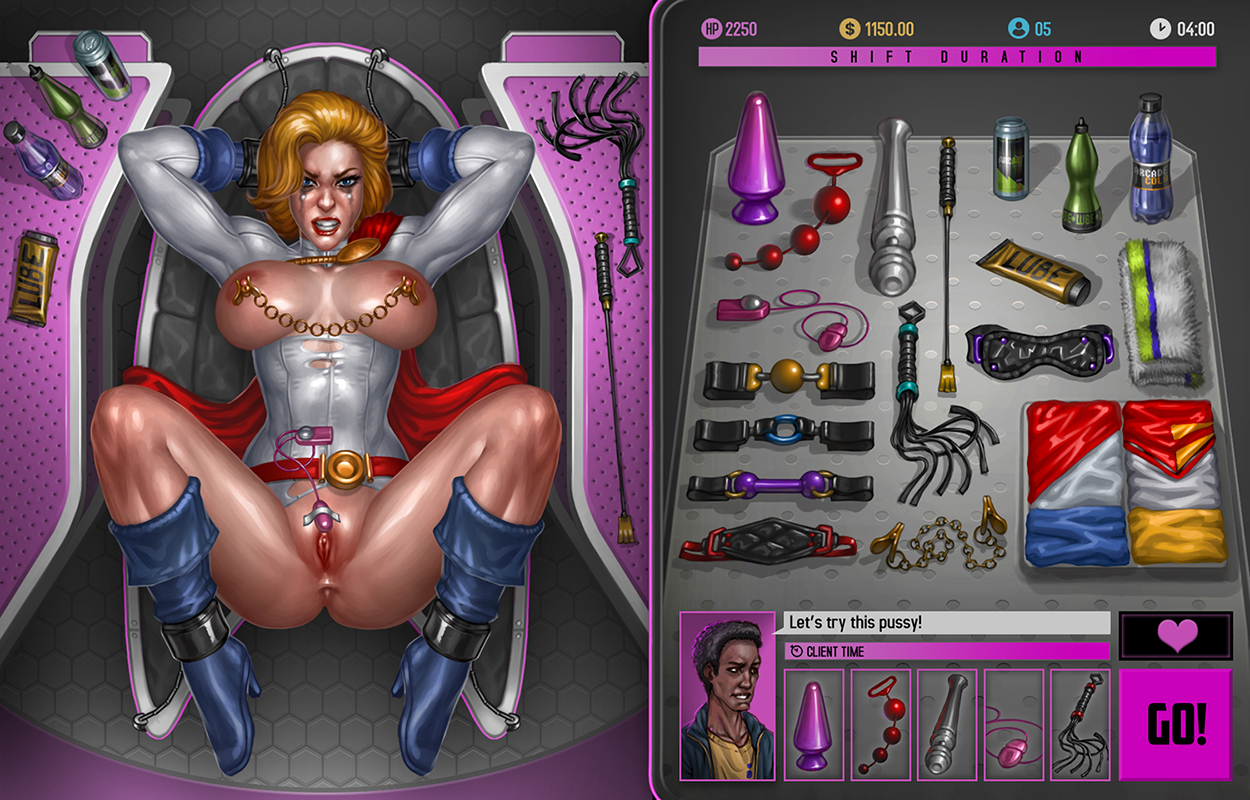
Sex-Arcade: The Game – Booth Area refined
Last week I showed you the first prototype for the Booth area, this week I will be showing the same area but with a more refined visual.
As you can see, the icons on the right side of the screen were changed to the actual objects in a table, also all the HUD elements were improved, and of course, the artwork itself is much more refined.
This area is not complete yet, there is still changes to be done as I had a few ideas that when implemented will change the positioning of some elements, but this image, together with the animation I did for the game cover, reflect the level of quality I want for both the game’s visual and animation.
Above the image you can see the first animation test I did for the game, this was made way before the animation for the cover, so it is much more rough and incomplete, I was still learning the animation program at the time so it doesn’t really reflect the quality you will find in the final game, but I thought it would be interesting to show how it all began ^^
And this is all the content I have to show for the game so far, from now on the core of the development updates will be made on the game’s patreon, but whenever I have some major update or when the game is complete, I will post it here as well.
Thanks for the attention and hope you like what you saw so far! ^^


this looks incredibly detailed! amazing artwork. curious if there will be more animation to the eyes/tear streams? keep up the great work!
Thanks very much Keeper! and yeah, there will be more animations, different facial expressions, etc ^^
Will
the game be released to Patreon supporters only? (Sorry, my keyboard glitched :P)
No, after the game is done, it will be released for free to anyone to download. but the patrons will get it a little early than everyone else ^^
Hi men! Awesome Power girl) I look forward to your game! Please tell me, in addition to training girls, Will the choice of partner? Werewolf, tentacles, monstercock, horsecock, knot and other?)
Thanks man! and unfortunately no, there won’t be any of those options in the game i’m afraid =/
The customers are different, why not add something like this?
because all the costumers will be regular humans, the SA is set in a universe very similar from ours, so there is no werewolfs and such as clients =/
Hi Sabu,
I’m a big fan of your work. I’ve got two questions:
Will Black Widow be part of this game?
And will you also include other “toys” like for example chloroform (to tame the girls)?
Thanks in advance.
Hey there TDiddy!
i`m not sure yet of what girls will be in the game, they will be decided by polls over at my patreon, but there is a chance that BW will be one of them ^^
and yes, there will be other toys, tho chloroform isn`t one of them.
cheers my friend!
Hey Sabu,
thanks for the quick response. Is there a chance, that you can add chloroform to the toys,or is it already too late for that?
I’m planning to join your Patreon 😉
No prob! and probably not i’m afraid =/ at this point the toys are already all chosen, but who knows, maybe in some future expansion of the game or something ^^ thanks for the support my friend! ^^
Nothing electrical??? And surely there should be Kryptonite?
sorry, not really into eletrical stuff =/ and there’s no need of Kryptonite, she is bound by psychic powers ^^
will there be a she-hulk booth or alot more booths in the future
there will be more booths for sure.
Sabu I am a big fan of your work I would love to contribute but I would like to see a demo of this game or if not I would like to know when the game would be finshed ?
thanks man! Right now I don’t have a date for release =/
Is the game out yet or no? If yes please add the link to the comment. I was a patron on patreon but have cancelled my subscription because of my money situation. Thanks and great work!!
No, the game is not out yet, I will make sure to post here and on my other galleries as soon as it is finished ^^
Awesome game, though,is it abandoned?
Thanks! and, no, game still in development ^^
Great work! please update the game. Thanks.